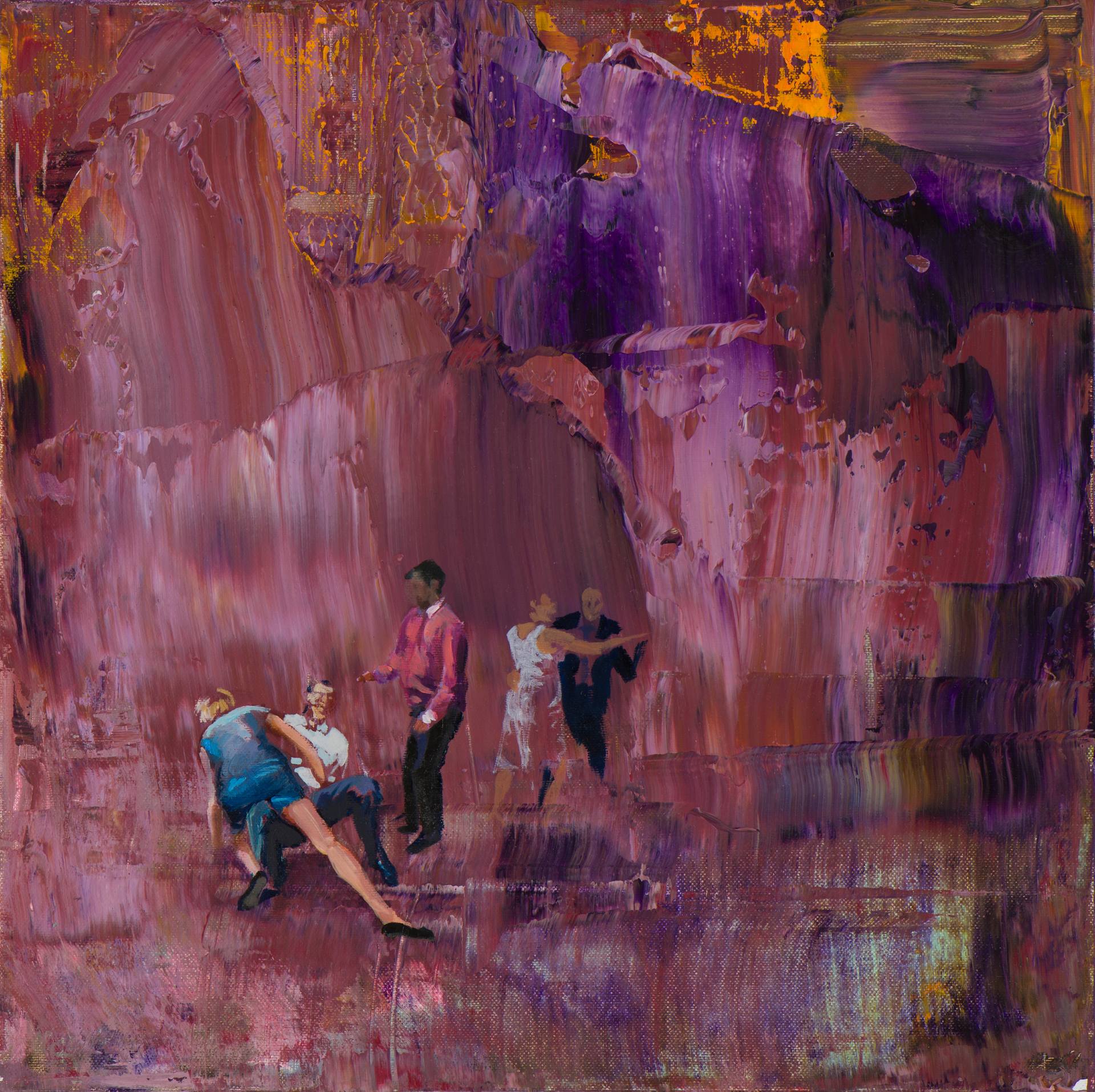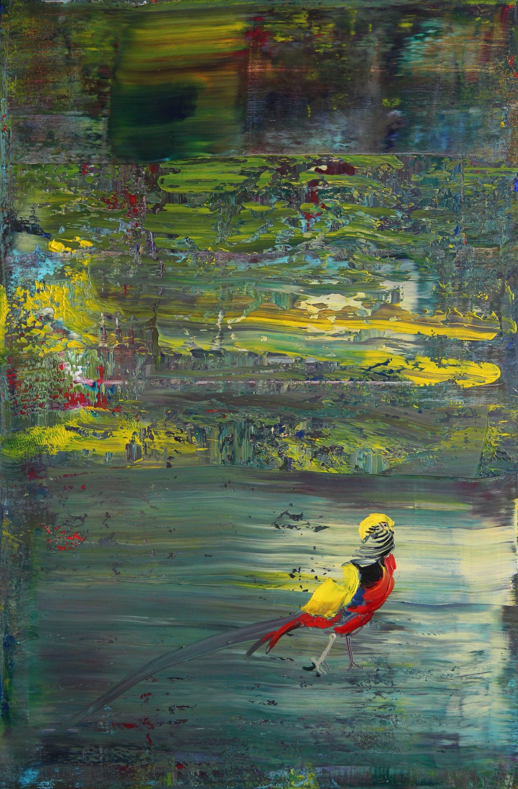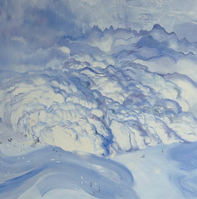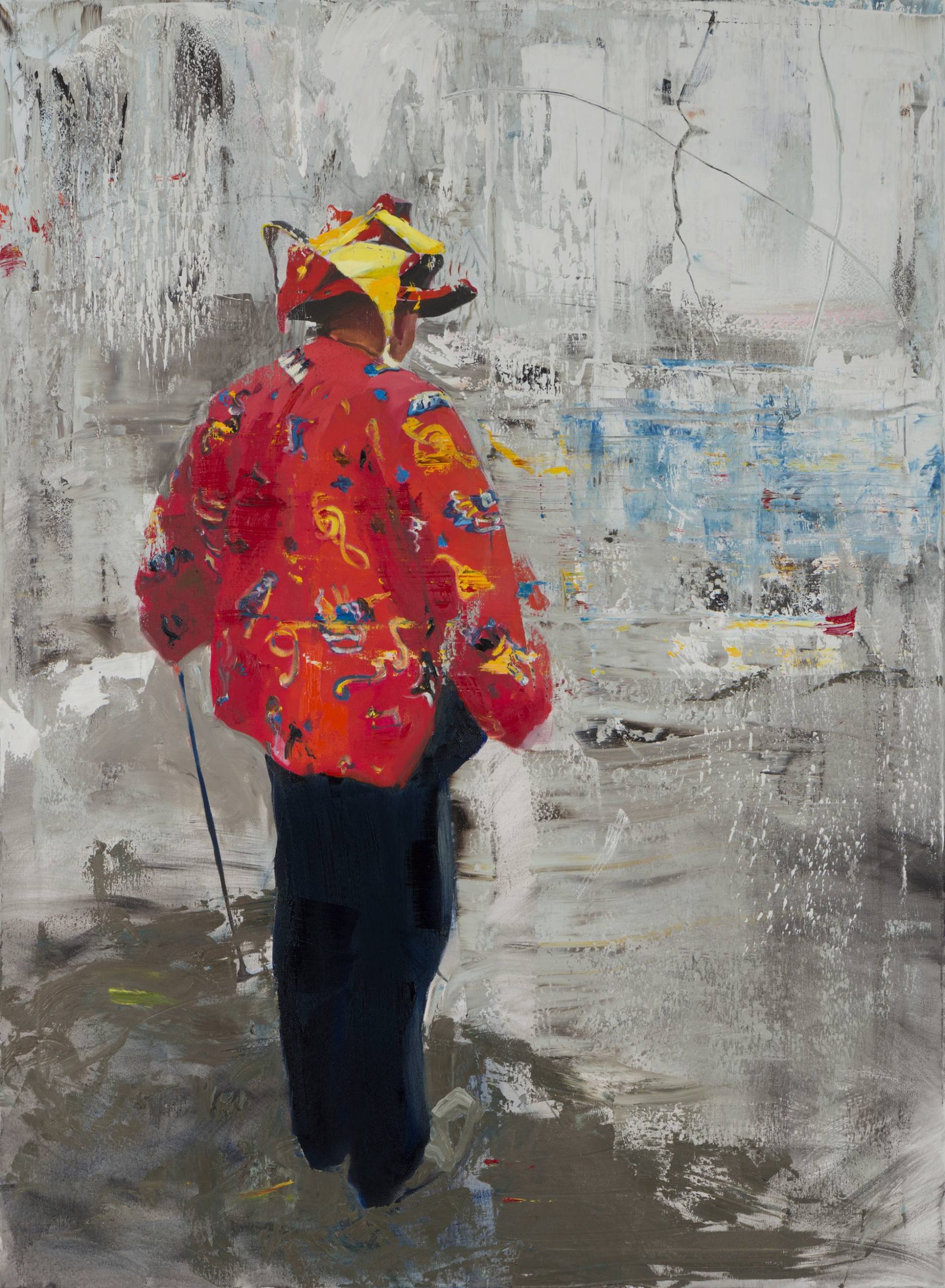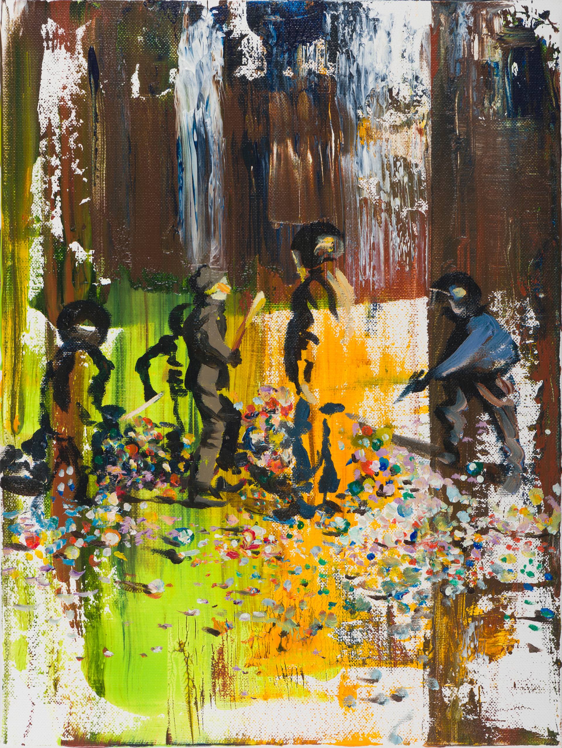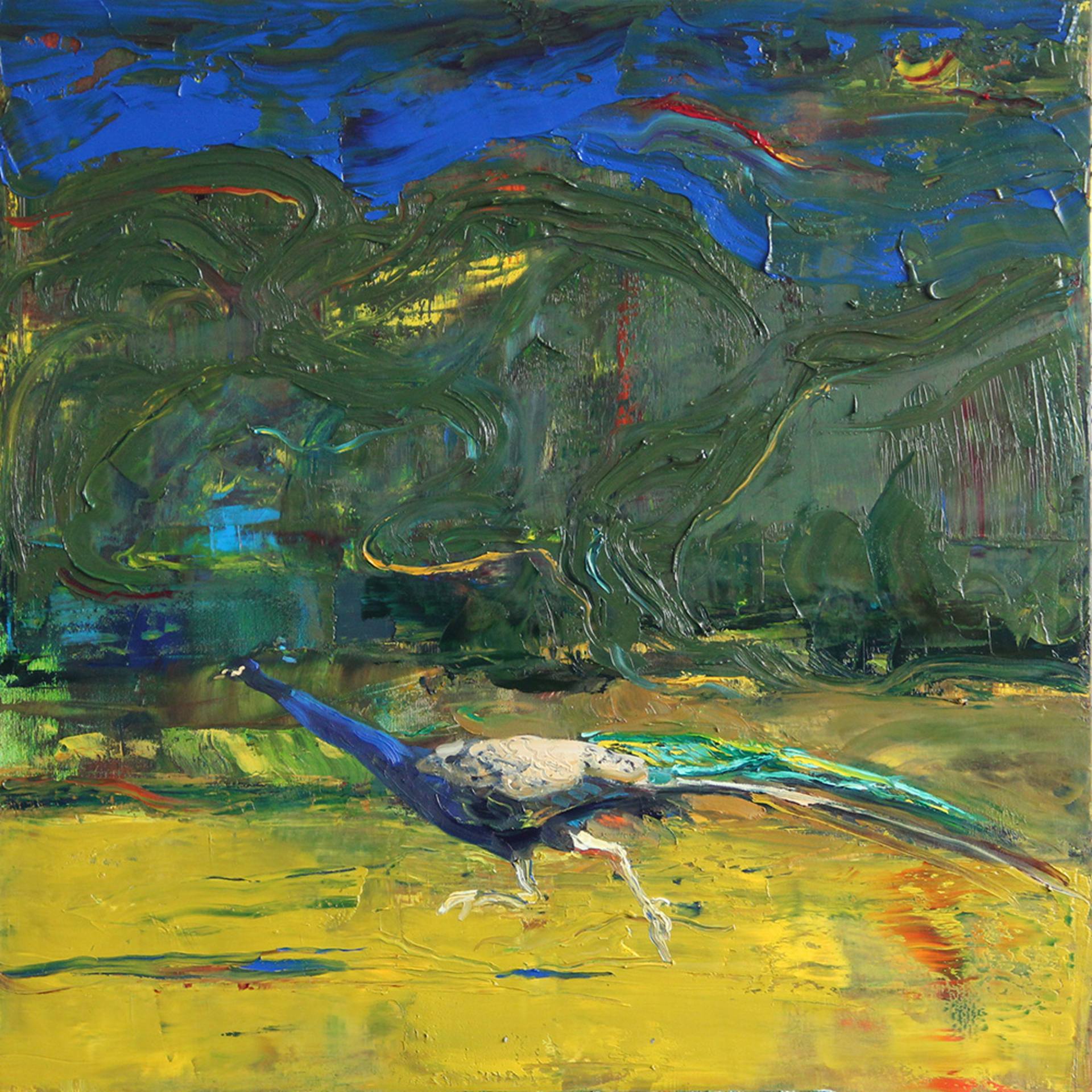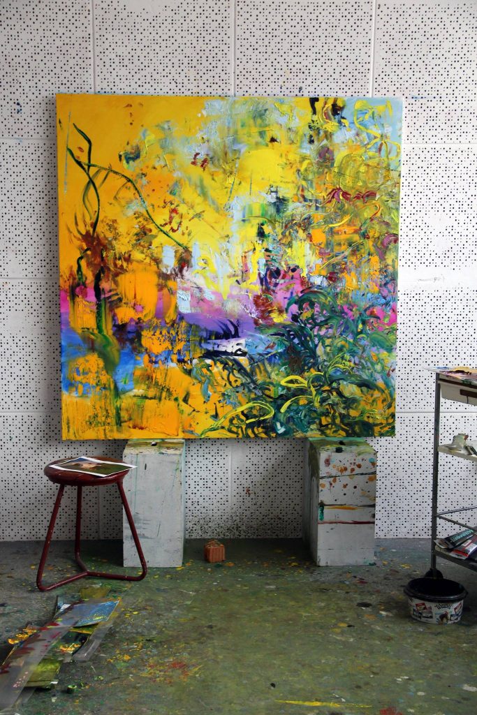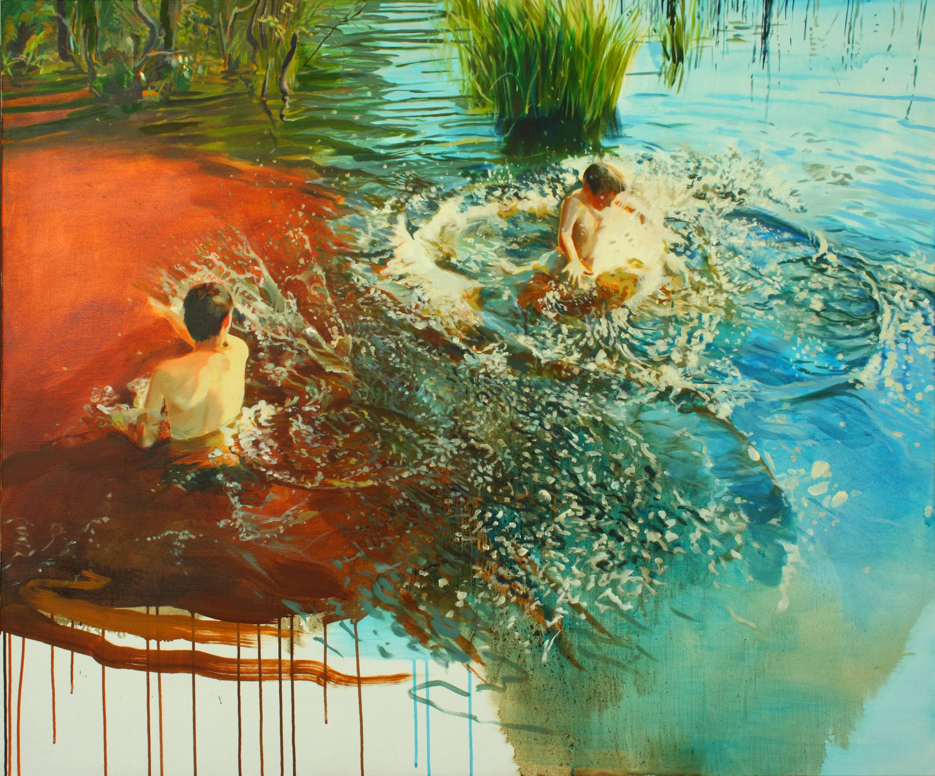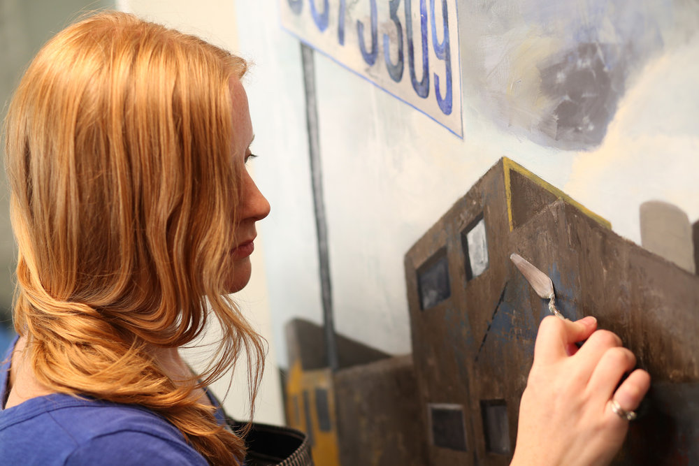
American artist S. Tudyk combines elements of abstraction and realism to create compelling images investigating the processes of fragmentation that pervade life, in thought and in matter. Recently, I have had the pleasure of conversing with S. Tudyk about her work.
Jacob Lee: Crumpled sheets of written-on paper are juxtaposed to geometrically patterned backgrounds; dilapidated billboards and theater screens expose their highly structured skeletons to the critical eye; the theme of entropy pervades your work, understood not only as the natural progression from order to decay, but also as the loss of meaning, the cryptographic obfuscation of intelligibility. Could you please discuss the role the theme of entropy plays in your work, and the relationship between your Paper-Marks and Land-Marks series in this regard?
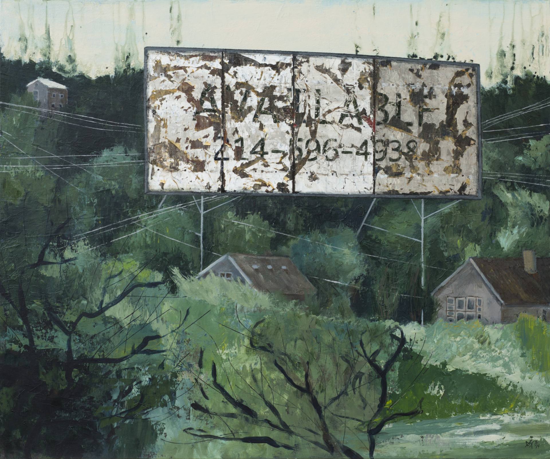
S. Tudyk: When I began painting billboards and drive-ins, I thought a lot about the relationship between their structures and the surrounding nature–their coexistence over time, and nature’s tendency to reclaim its space. Driving by billboards in life, they seem to stand like giant artboards demanding our attention. I’ve always preferred the empty faces to the ones selling something. I believe the textures have a truer story to tell, the patina of an object revealing its impermanent and transient beauty. I find so much allure in deteriorating textures–it’s what drives me to paint them this way.
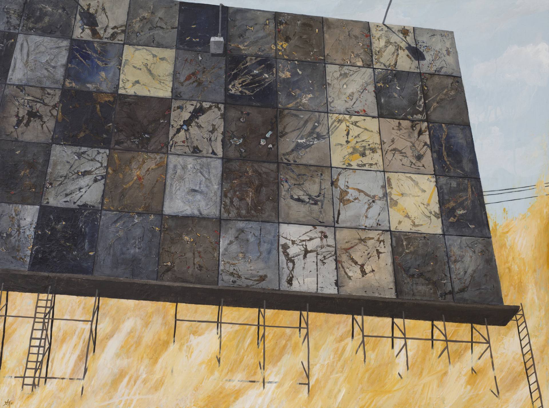
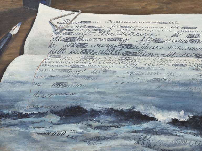
I actually hadn’t considered the crumpled paper artworks in relation to the definition of entropy. It’s interesting to think of them in terms of breaking down language. Although, while there is an obscurant in the design, I would argue that the meaning is not necessarily lost. Perhaps it is given new meaning, in a new form. Or at least it is shielded from a quick-read, forcing the viewing to study it.
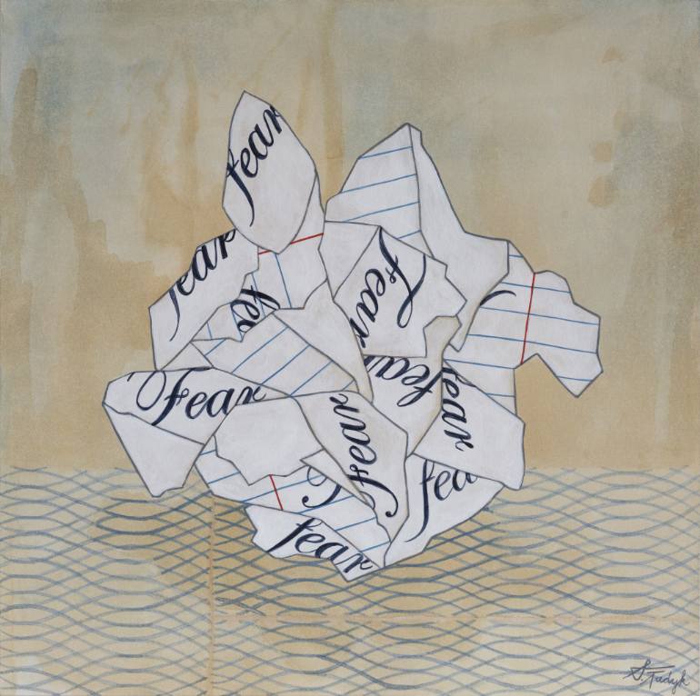
The beginning works in the Paper Marks series came from the idea of a handwritten letter too powerful to send. The thought is given power through documentation, and the destruction of crushing the paper takes the power away. The shifting ground it sits on (the geometric pattern) is inspired by security envelope patterns, symbolizing an exposed, broken security. To retain a sense of privacy, I treat these messages like secrets as I dissect the shapes of letters to create a new arrangement of its parts. The original messages themselves might be related to a form of entropy, as they reflect a personal memory. I am conscious of memory’s slow decline over time, and I act to preserve it in the moment that the painting captures.
As for the relationship between the two series, when I began, the two bodies of work had a general connection as symbols of communication. I believe they are beginning to share more similarities now, through an exploration of fragmentation.
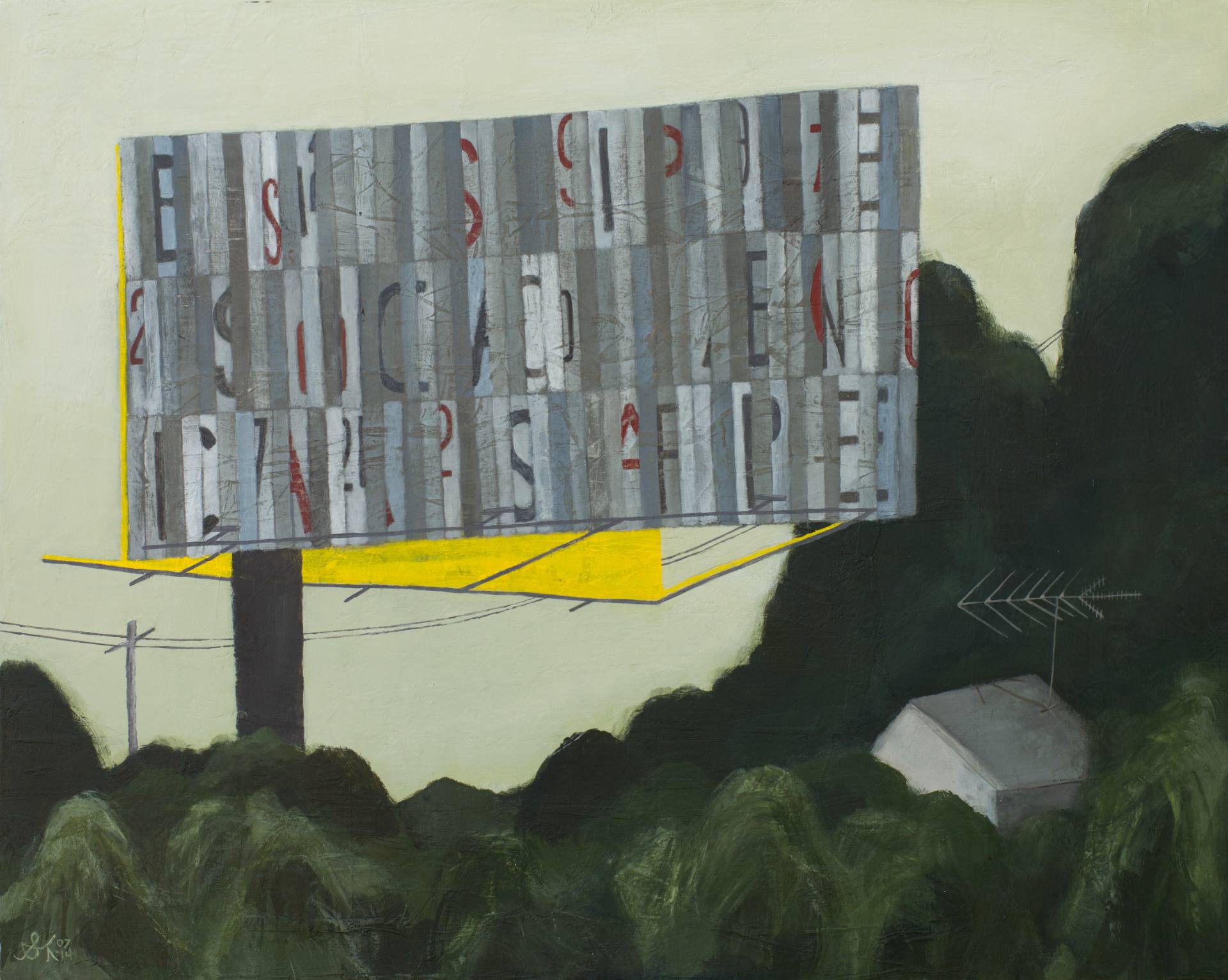
Jacob Lee: Billboards are public; while, in theory, their messages might be cryptic so that their secret meanings may only be intelligible to a few, in practice, and usually intent, their messages are directed to a broad audience. The intelligibility of those messages may be obscured with decay, their motivating contexts lost with time and forgetfulness of the past, but these are passive outcomes: they take no work to achieve, but arise out of the entropic nature of the world. However, in several of your billboard paintings, and in your two Landmark/Messages series, which I like very much, it seems that you are actively trying to make the public, private; the open, secret; the clear, obscure. Could you elaborate on your motivation for doing this?
S. Tudyk: I began thinking specifically about your question just a few months ago. In my sketchbook, there is a simple drawing of an envelope inscribed with the words “bury deep” propped up on billboard legs. Notations underneath it read:
private vs. public
to put personal things on display?
DISPLAY SECRETS
memories with legs
what does a billboard symbolize?
something you want everyone to know
CODED scrambled
pattern of sharing without sharing
I like having some pay-off for studying a work. Billboard advertisements are designed to be able to digest within a fast-passing moment. I create my billboard artwork with the hope of forcing the viewer to slow down and notice details.
Jacob Lee: Reading your notes, it occurs to me that there are things we do in private, but which are not secret at all; we close the door to maintain privacy, and perhaps modesty, but not secrecy. Some secrets cannot be revealed without causing shame, and provoking punishment. Some private things are already known, but cannot be revealed without provoking the same.
Your comment regarding forcing the viewer to slow down recalls something I read once on Nautilus, about the aesthetic role of the temporal dynamics of interpretation in the comprehension of literary passages. A capable writer will use the subconscious expectations and associations of the words on the page as they will occur to the reader as they are being read so as to create tension, auditory allusions, imagistic analogies, and unrealized potentialities that flavor the text. I am curious as to how a similar temporal dynamic might work for a piece of visual art, which cannot wholly rely on the ordering of words to achieve an effect.
S. Tudyk: It’s interesting to think about the meanings of privacy and secrecy within different contexts. While not all private or secret instances are purely thoughts and feelings, I tend to think of the mind as the space where they live for me. Everyone has this other world, a private world in their mind. Occasionally confessions spill out in correspondence. As for shame and punishment, I wonder if holding on to secrets, in a way, is it’s own punishment.
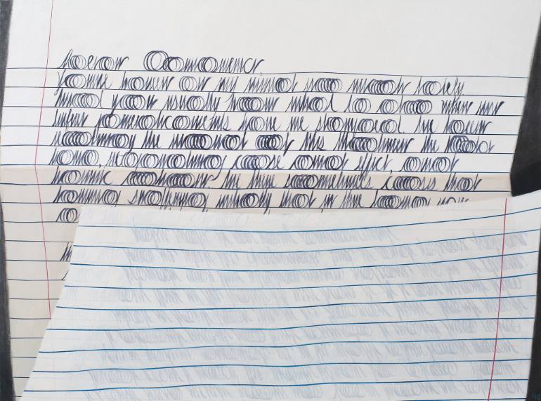
In regard to the Nautilus article, I like the idea of the meaning of a work unfolding over time. Literary passages have a direction you must follow to comprehend, reading from left to right, from the beginning to the end of a sentence. In viewing an artwork, your eye moves across in any number of directions. Although, there are certain ways an artist can direct the visual passage and also create tension. For example, a shape placed at an angle in a composition will create more tension than one straight on; a scribbled text will generate a more uneasy feeling than a carefully rendered one; you can direct the eye with an intensity or contrast of color or with pattern.
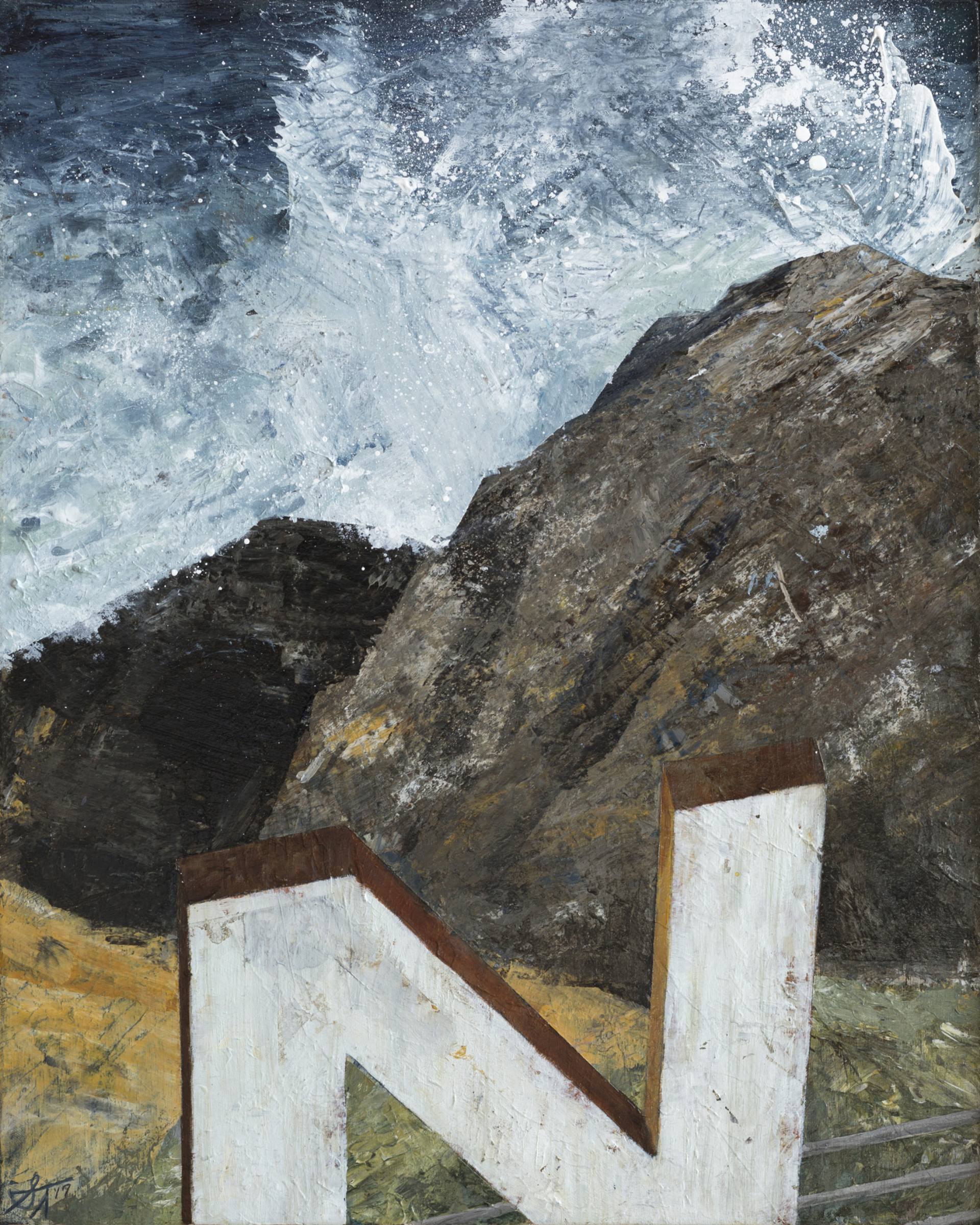
Jacob Lee: I’ve noticed a recurring element of water, or water-like motifs, in your recent work. Water is so dynamic and evocative, and can be used in so many ways. Can you tell me a little more about that.
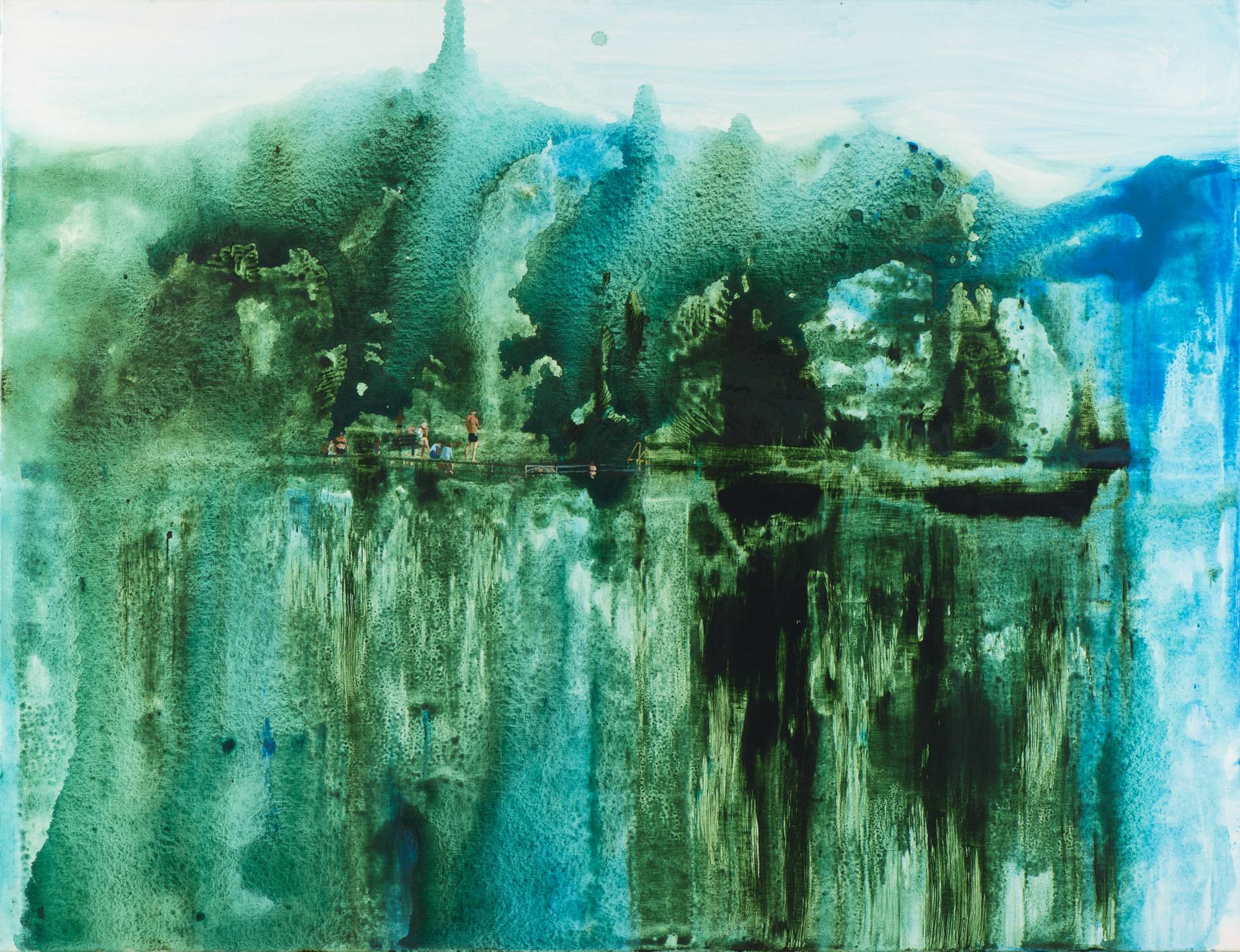
S. Tudyk: When I first painted water, it was to convey an overwhelming emotion in a letter to a friend. The idea of tears becoming an ocean seemed fitting to describe the power of the momentary state of mind I was in.
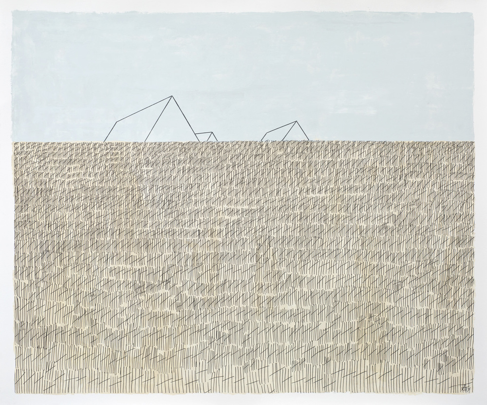
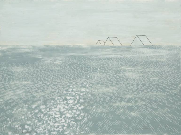
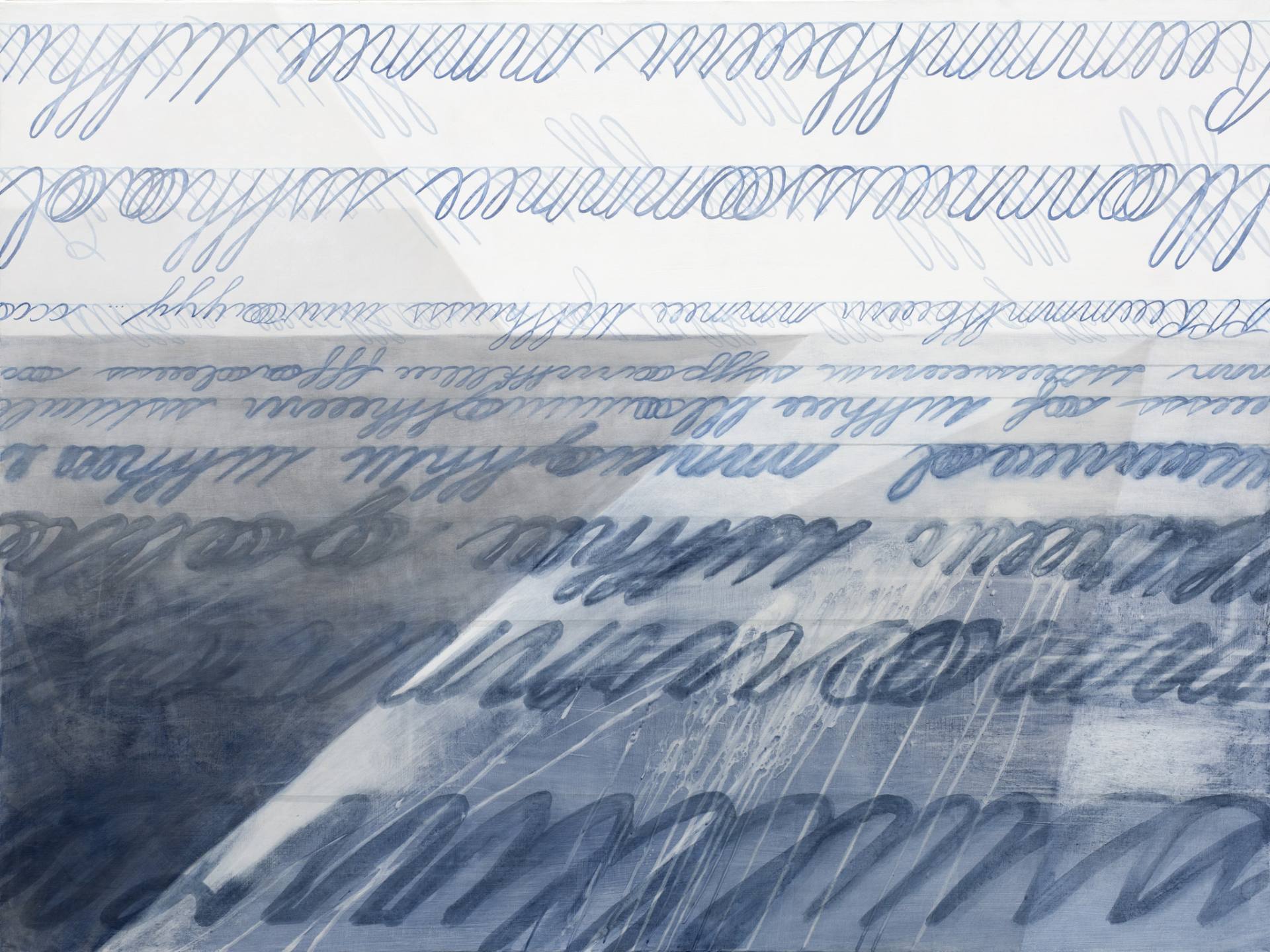
More recently, it was my goal to use water to describe a place. I revisited an idea from 2015 that depicted the grasses of Marfa, Texas–a place I visited briefly in 2014 that had a great impact on me. I wanted to recreate that composition to reflect where I’m living now in Marblehead, Massachusetts. (Marblehead is a beautiful historic New England coastal town surrounded by rocks and water.) The tally marks shifted from grass to water, while keeping their representation of passing time. The triangular forms [for me] represent a folded letter, a letter never sent that stays on the horizon of memory. It feels natural to include water in my work now when I’m steps away from the ocean and constantly in awe of it’s array of colors and vastness.
Jacob Lee: It seems like a great deal of thought goes into planning your pieces. Could you tell me a little about your method?
S. Tudyk: Sometimes I start with a sketch of an idea, and other times I start with photography. There is always a back and forth between sketch book and computer to create my composition. For the Structures, I’ve taken hundreds of my own photos, but I also reference images online to see the different styles of billboards, drive-in theaters and deterioration. I often combine elements from multiple sources. A few from the Paper-Mark series rely heavily on photography I set up in my studio and have additional computer comping work (for example, the perspective looking through a folded piece of paper combined with an abstracted pattern of handwriting that falls in perspective with the paper).
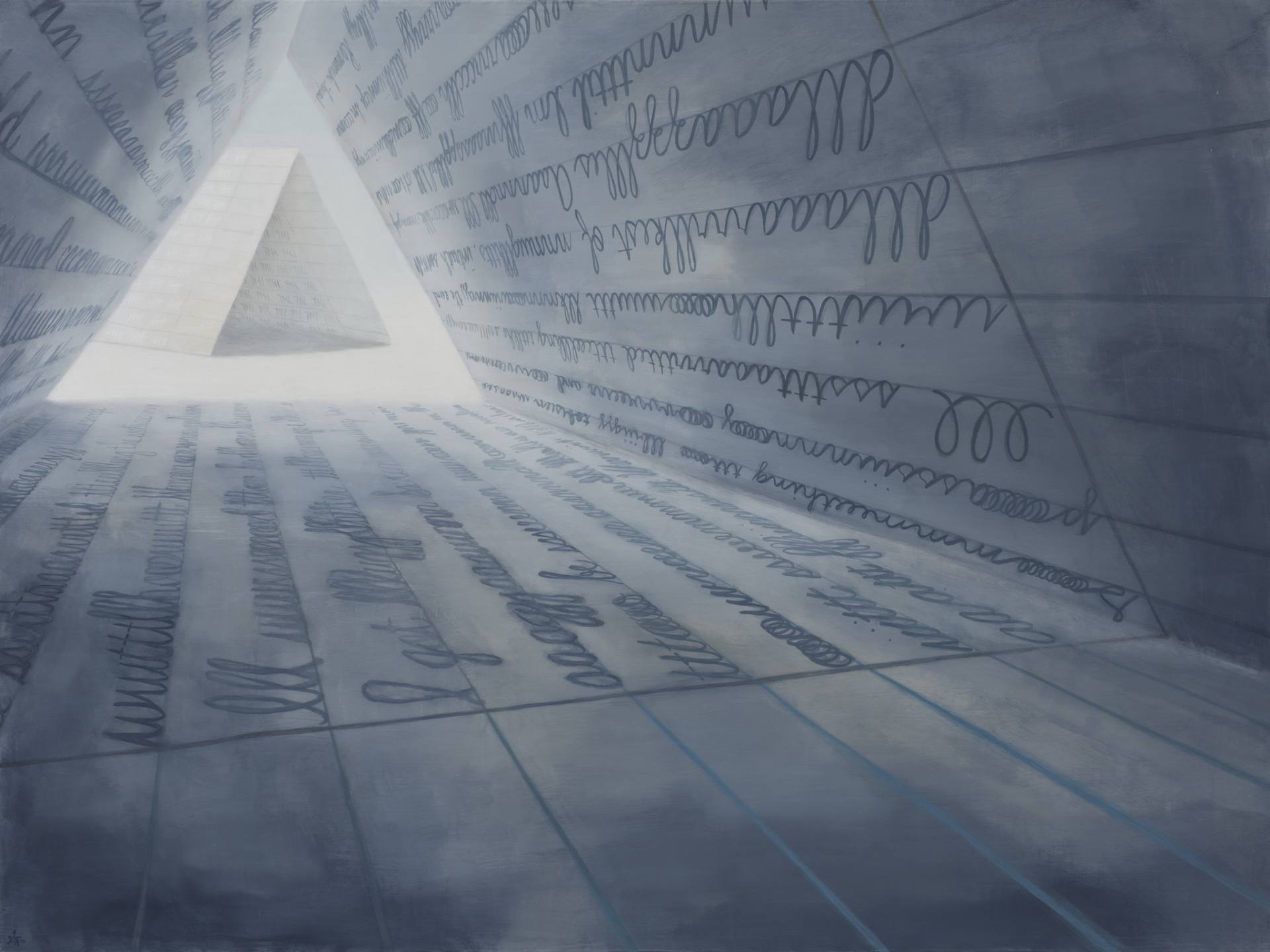
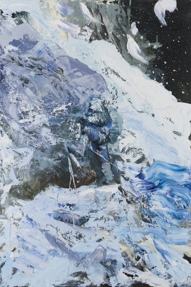
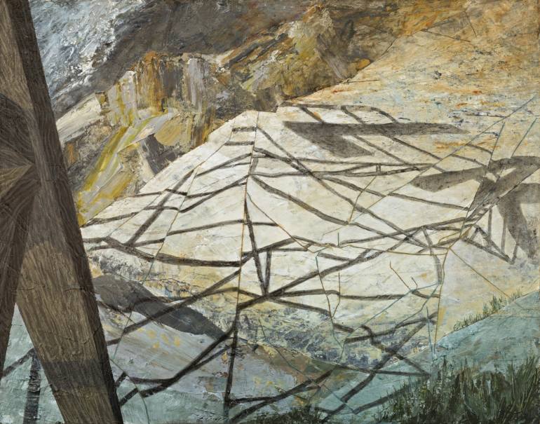
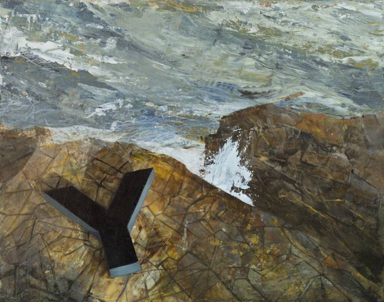
For Message Series 2, I began with a process of tracing creases from crumpled paper which led to mimicking the patterns of the rocks. I also referenced my photography of the coastal landscape and combined those images with a 2D graphic (the billboard structure) that I drew in a 3D program. On several of the works I printed a computer rendered shadow, crumpled that printed page, and merged the distorted shadow back into the composition.
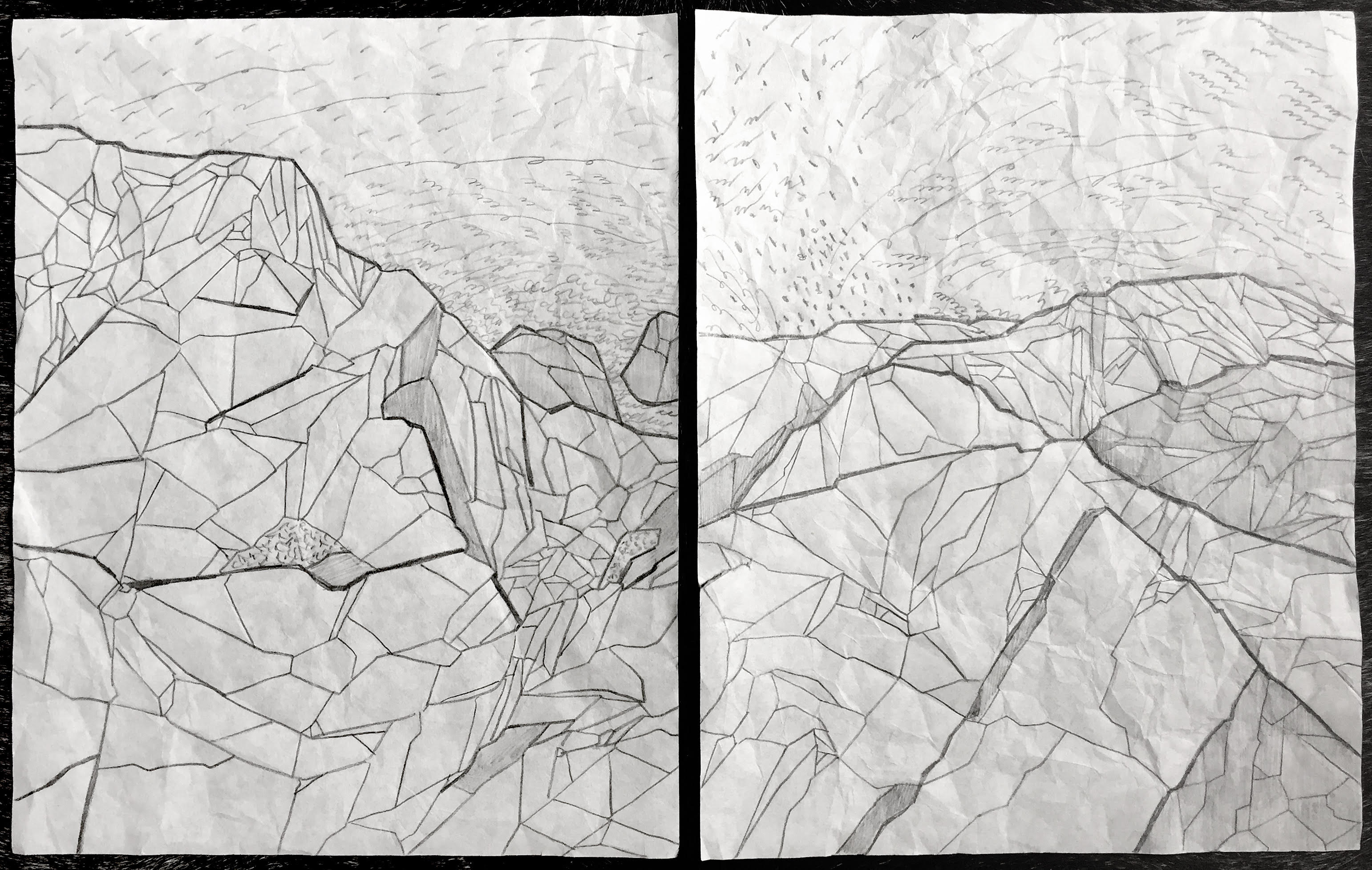
I sometimes wish I could just sit down and paint, but I also think all of the process pushes me into a direction that becomes essential to the finished art. I’m happiest when there is structured process that ends with some part of the plan being spontaneously destroyed.
Jacob Lee: Any future plans, exhibits or upcoming projects you would like to bring to readers’ attention?
S. Tudyk: I’m in a transitory place right now, so I’ve been hesitant to plan exhibitions, although the ideas haven’t stopped coming. I want to revisit that process of chaos and chance in the act of crumpling paper and then tracing the ridges. That idea has about five or six branching ideas that relate to both series of work.
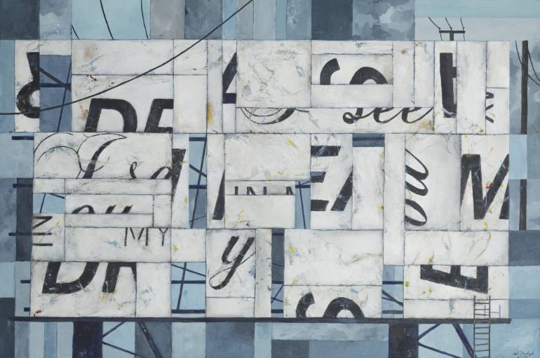
I also plan to create more works in the style of, I See You In Dreams, flattening and breaking apart the structure, typography, and its surrounding landscape into a complex grid. I have bigger ideas too, but I try not to get too ahead of myself. Creation has a hard time keeping up with conception, and time is slippery.
